· Updated
CSS for Beginners: A Practical Guide to Web Styling.
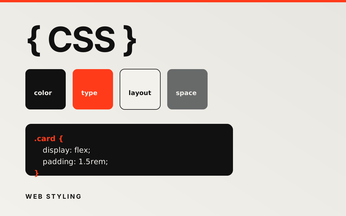
CSS (Cascading Style Sheets) controls how HTML looks in the browser — colours, typography, spacing, and layout. After you understand basic HTML structure, CSS is the next skill that turns plain markup into a polished interface.
What is CSS?
CSS is a stylesheet language that describes presentation rules for HTML elements. It separates content (HTML) from design (CSS), which makes sites easier to maintain and style consistently.
Why use CSS?
- Keep presentation separate from content.
- Reuse styles across multiple pages.
- Build responsive layouts that adapt to different screen sizes.
How CSS works
CSS applies styles through rules. Each rule has a selector (which element to target) and one or more declarations (property and value pairs).
selector {
  property: value;
}
- Selector — the element(s) to style, such as
por.card. - Property — what to change, such as
colororfont-size. - Value — how to change it, such as
#111111or1.125rem.
Example
h1 {
  color: #111111;
  font-size: 2rem;
  margin-bottom: 1rem;
}
Ways to add CSS
- External stylesheet (recommended):
<link rel="stylesheet" href="styles.css" /> - Internal styles: a
<style>block in the document head. - Inline styles: a
styleattribute on an element (use sparingly).
Common properties
Typography
color,font-family,font-size,font-weightline-height,text-align,letter-spacing
Backgrounds and borders
background-color,background-imageborder,border-radius
Spacing and size
width,height,max-widthmargin(space outside an element)padding(space inside an element)
Layout
display— block, inline, flex, gridposition— static, relative, absolute, fixedflexandgridproperties for modern layouts
Selectors worth knowing
p { }              /* element */
.intro { }         /* class */
#main { }          /* id */
a:hover { }        /* pseudo-class */
.card img { }      /* descendant */
Responsive design
Use media queries to adjust styles at different viewport widths:
@media (max-width: 768px) {
  h1 {
    font-size: 1.75rem;
  }
}
Practice tips
- Style one small page before tackling a full site.
- Use browser DevTools to inspect and test changes quickly.
- Prefer classes over inline styles for maintainability.
- Combine CSS with semantic HTML for accessible, readable pages.
Comments
No comments yet.