· Updated
QR Code Printing Size and Contrast Guide.
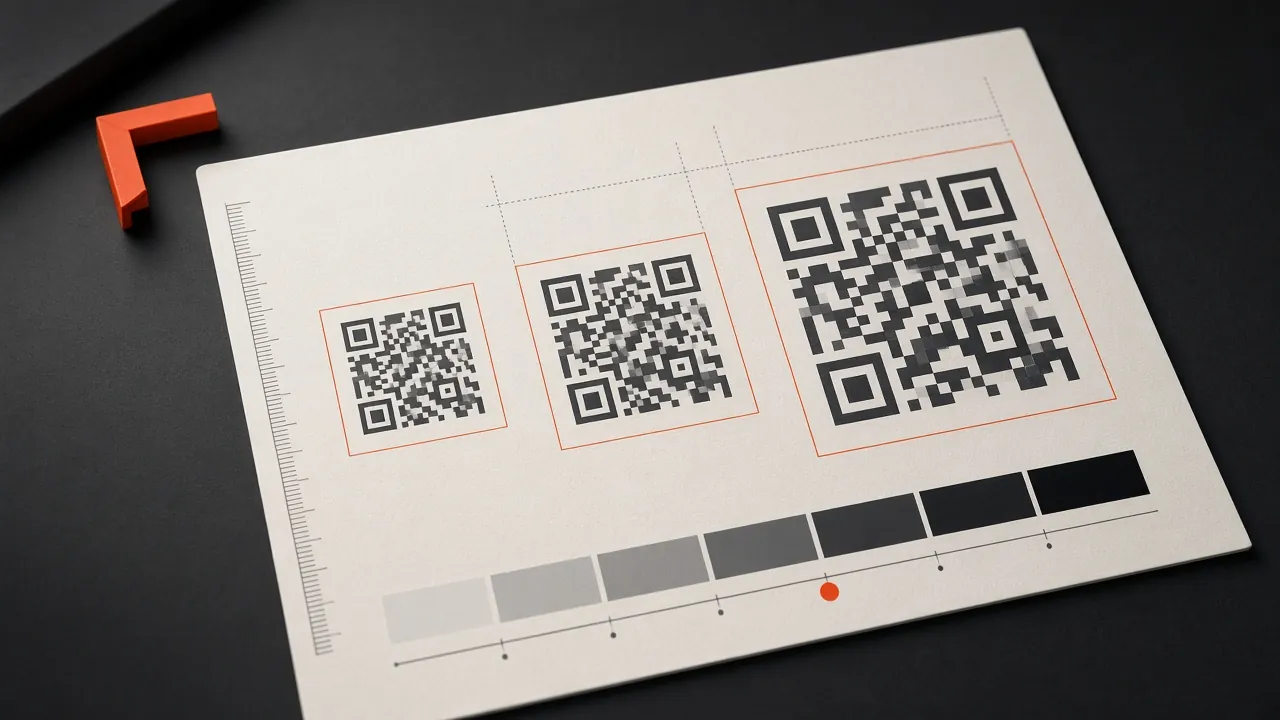
A QR code that scans on a monitor can fail after printing because of size, contrast, surface, lighting or changes made in the final layout. Treat scan testing as part of production, not as an assumption.
Size for the viewing distance
There is no universal minimum for every code. More encoded data creates a denser pattern, and greater scan distance requires a larger physical code. As a practical starting point for close handheld use, test around 2–3 cm square, then increase the size for denser content, imperfect printing or longer distances.
Protect the quiet zone
Keep a clear margin around all four sides. Do not let text, borders, logos or background patterns touch the modules. Cropping that margin is a common cause of unreliable scans.
Use strong contrast
A dark foreground on a light background is the safest arrangement. Avoid glare, transparency, gradients through the code and similar foreground/background brightness. A phone camera must distinguish the module edges quickly.
Use suitable artwork
Download SVG for scalable print layouts or a sufficiently large PNG. Do not stretch the code out of square or export it through heavy image compression.
Test the production result
Print a proof at final size and material. Test several phones, angles and lighting conditions, then verify the encoded destination. Use the free QR generator to create the source artwork.